Pull up five dental practice websites right now. Any five. Read the hero sections out loud.
“Your smile is our priority.”
“Caring, compassionate dental care for the whole family.”
“We accept most insurance plans.”
They all sound identical. Interchangeable.
A blur of pastel blue gradients and stock-photo smiles that could belong to any practice in any ZIP code in America.
There’s a reason for that. Most fee-for-service dental practice websites’ copy was built for the insurance-shopping patient, because that’s who the PPO-dependent practice model has always had to chase.
And every template-heavy agency serving those practices has been recycling the same playbook for fifteen years.
Here’s the problem. If you’re running a fee-for-service practice, or transitioning toward one, you just inherited website copy that was written for the exact wrong patient.
Your dental website copy is doing more qualifying work than your front desk ever will. When it reads like a pamphlet at the dentist’s office, you’re losing the patients you actually want before they pick up the phone.
And the insurance-first framing isn’t just outdated.
It’s actively working against you in a market where dental insurance is quietly collapsing as a selling point.
A February 2026 report from the CareQuest Institute for Oral Health found that roughly 12% of insured American adults, about 32 million people, reached or exceeded their annual dental benefit maximum in 2024. Nearly half stopped treatment as a result.
-CareQuest Institute for Oral Health, February 2026
Translation: insurance isn’t the competitive advantage your old copy thinks it is. And writing a dental website that centers it might be the most expensive mistake your practice is making.
Table of Contents
What “Reading Like an Insurance Brochure” Means for Your Fee-For-Service Dental Practice Websites’ Copy
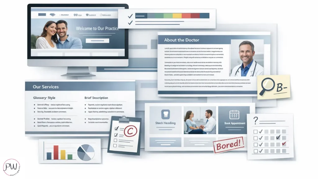
Every insurance-brochure style website has the same tells:
- The hero section opens with “Welcome to Our Family.”
- A wall of insurance logos sits above the fold.
- The about page reads like a LinkedIn bio with better lighting.
- Service pages are bullet-point procedure definitions lifted straight from the ADA glossary.
And not a single sentence on the homepage could not also appear on the site of the practice across the street.
So why do so many dental websites look and sound identical? Because most of them were built by template-heavy agencies serving volume-driven practices.
Volume models need low-resistance copy that won’t scare off anyone. The safest bet for a PPO-dependent practice is to sound exactly like every other PPO-dependent practice.
Blend in. Stay on the map. Catch the spillover.
That strategy might work when you’re fighting for insurance network visibility. But for an FFS practice, neutral copy isn’t safe. It’s forgettable.
And forgettable is the most expensive thing your website can be.
I’ve audited a lot of dental practice websites. The single most common finding isn’t broken SEO, slow page load, or a confusing menu structure. It’s copy that refuses to say anything specific.
I’ve seen practices invest $30,000 in a redesign and walk away with a beautiful site that says absolutely nothing.
No point of view. No claim. No reason for a $4,000 case to land in that practice rather than any other.
Bland copy doesn’t lose patients because it offends them. It loses patients because they never remembered the site in the first place.
Why Insurance-Brochure Copy Repels Fee-for-Service Patients (Even When They’re Ready to Book)
Fee-for-service patients aren’t shopping for networks. They’re shopping for trust, clinical quality, and experience. Which means the exact copy designed to “not scare anyone away” is actively scaring off the patient you actually want.
Think about the signal insurance-first copy sends. A patient paying $3,500 out of pocket for a crown reads “we accept most major insurance” and immediately clocks your practice as volume-driven.
Volume telegraphs rushed appointments. Fifteen-minute hygiene slots. Junior associates handling complex cases. A front desk that knows every PPO fee schedule by heart.
None of that is what an FFS patient is willing to pay premium prices for.

However, this isn’t an argument for hiding payment information entirely. FFS patients still want to understand what they’re paying for and how. The issue is sequence.
What comes first in your copy is what defines your practice in the reader’s mind. Lead with insurance and you’ve told the patient you’re in the insurance business. Lead with your clinical philosophy and you’ve told them something completely different.
Your dental website copy isn’t just content. It’s a filter. And when it’s pointed the wrong way, it filters out exactly the patients you built your practice to serve.
The research backs this up.
A June 2025 national survey of 1,024 U.S. adults conducted by rater8 found that 84% of patients check online reviews and practice content before booking care, and 61% now weigh online reputation more heavily than personal referrals from friends and family. (Source: rater8 “The Next Evolution of Patient Choice” Report, August 2025)
Your site is doing the qualifying work whether you like it or not. The only question is whether it’s qualifying patients for you or against you. What does yours say about you right now?
The Real Job of Your Dental Website Copy (And It’s Not What Your Last Agency Told You)
Most dental websites are built to inform, list services, and look professional. Every dental website does those things. None of that moves a patient to book.
The real job of your dental website copy is narrower than that, and harder. It’s to make the right patient feel seen in under ten seconds, and to make the wrong patient self-select out without anyone having to say no.
That’s a high bar. But the revenue math makes it worth clearing.
When your copy does its job, your front desk stops fielding price-shopping calls from patients who were never going to accept treatment anyway. That alone is worth the rewrite. Factor in the case acceptance lift from patients who arrive pre-sold on your philosophy, and the ROI starts looking ridiculous fast.
Practices that rewrite their homepage and top three service pages with true FFS positioning typically see a measurable shift in the quality of their inquiry volume within 60 to 90 days.
Fewer calls. But better calls. Higher-value cases booked at higher acceptance rates.
The phones don’t necessarily ring more. They ring differently.
Even so, most practice owners hesitate to make this change. Granted, it can feel risky to narrow your copy. What if you repel patients you would have otherwise converted?
Here’s the answer: you wouldn’t have converted them. The patient who needs insurance-first copy to feel comfortable booking was never going to be a $12,000-case patient. Letting that patient self-select out of your funnel isn’t a loss. It’s a win.
7 Dead Giveaways Your Website Reads Like an Insurance Brochure
Read this list with your own site pulled up in another tab. If you catch more than three of these, your copy is leaking revenue right now. Ready?
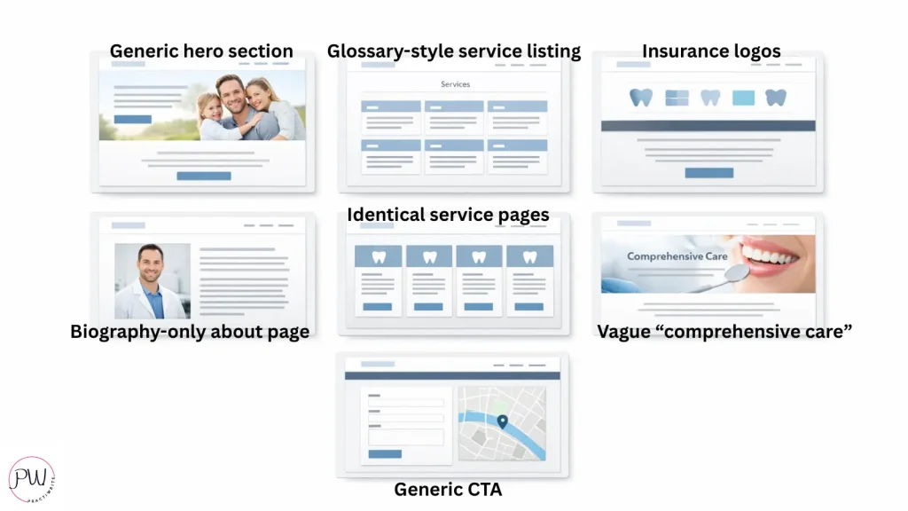
Dead Giveaway #1: You open with “Welcome to our practice”
The hero is the most valuable real estate on your website. Half of dental homepages burn it on a greeting. Welcome signs belong on doormats, not on the page doing the most selling.
Dead Giveaway #2: Your services are defined, not framed
“A crown is a tooth-shaped cap placed over a damaged tooth.” Cool. So is every other service page in the ADA procedure codebook. What does a crown at your practice mean for a patient paying out of pocket?
Dead Giveaway #3: You lead with insurance logos above the fold
Nothing signals “we run on volume” faster than six insurance badges stacked above your hero. FFS patients read that instantly as “this practice is built around payers, not patients.”
Dead Giveaway #4: Your about page is a bio, not a philosophy
Listing where the doctor went to school is table stakes. Why they practice the way they do is the part FFS patients actually need to see.
Dead Giveaway #5: Every service page has the same length and tone
Template smell. When your cleaning page and your full-mouth reconstruction page read with identical energy, you’re signaling “we do everything,” which reads as “we specialize in nothing.”
Dead Giveaway #6: You use “comprehensive care” without defining it
“Comprehensive” is the single most overused word in dental website copy. It tells a patient exactly zero about what they’ll actually get. Swap it for specificity every single time.
Dead Giveaway #7: All your CTAs say “Contact Us”
The weakest CTA in dentistry. It asks nothing, promises nothing, and makes the patient do the cognitive work of figuring out why they’d even bother.
How to Rewrite Your Dental Website Copy So It Attracts the Right Patient
Rewriting dental website copy isn’t about hiring a fancier copywriter. It’s about applying five principles that the template agencies don’t use because they don’t want to.
Principle 1: Lead with a point of view, not a greeting
Your hero should make a claim about how you practice dentistry. A claim your competitor down the street can’t copy without it sounding ridiculous on their site.
Principle 2: Write to one patient, not to everyone
FFS copy is specific. It names a patient, a problem, and a reason that patient picked you over the in-network practice six blocks away. Writing to everyone means writing to no one.
Principle 3: Replace definitions with decisions
On every service page, answer the question the patient is actually asking, which is almost never “what is this procedure?” It’s “why would I choose this practice for this procedure, given what I’m about to pay?”
Principle 4: Sequence matters more than content
Insurance info isn’t banned. It just doesn’t go first. Lead with clinical philosophy, patient experience, and outcomes. Payment mechanics earn a spot further down the page.
Principle 5: Own a perspective your competitors won’t.
This is the single biggest shortcut to copy that doesn’t sound like everyone else’s. If you can say it, and your competitor can’t or won’t, put it on your homepage today.
When I audit dental practice websites, I run one brutal test. Could this homepage appear verbatim on the site of the practice across the street without anyone noticing?
Nine times out of ten, the answer is yes.
That’s not a content problem. That’s a positioning problem dressed up as a content problem.
The FFS Dental Website Copy Blueprint, Page by Page
Here’s what the fix actually looks like in practice. Start with your homepage, then work backward into service pages as bandwidth allows. Sound doable?
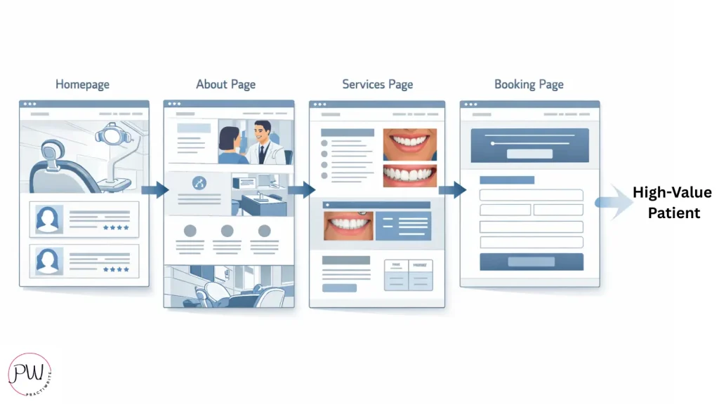
The Homepage
Hero leads with point of view plus outcome. Sub-hero names the specific patient you serve best. Proof block shows results, not insurance logos. CTA tied to a specific next step for a specific patient type.
No generic greetings. No “comprehensive family dentistry” filler. No stock smiles.
The About Page
Lead with practice philosophy, not biography. Explain why you’re fee-for-service in plain language, without apology or defensiveness.
Name what you believe about dentistry that other practices won’t say. Close with the patient experience promise the reader can expect to feel on their first visit.
Service Pages
One page per service. Not per symptom, not per keyword variation. Write each page around the FFS patient’s actual decision question, not a procedure definition.
Include visual proof specific to that service, whether that’s before-and-after photos, case studies, or outcome data. Price transparency where appropriate builds trust faster than any testimonial will.
The Contact and Booking Page
Replace “Contact Us” with a specific action verb tied to a specific outcome. “Request a Consultation for Full-Arch Implants” beats “Contact Us” by a mile.
Set expectations about what happens after they submit. Remove every form field that doesn’t matter, because each extra field loses a percentage of patients right there.
This isn’t a complete website rebuild. It’s a copy rewrite of four page types. Most practices can knock it out in six to eight weeks with the right strategy and writer (hint, hint 😉) in place.
What Changes When Your Dental Website Copy Stops Reading Like a Brochure
The shift shows up in five places, fast. Want to know what to watch for?
Call Quality Improves First
Your front desk notices within weeks that the inquiries coming in are different. Fewer “do you take my insurance” openers. More “I’ve been looking at your website and I’d like to know more about your approach to [specific case]” calls. Those are the calls that book.
Case Acceptance Climbs At The Consult Chair
The copy has pre-sold the philosophy before the patient ever walked in, so the doctor isn’t starting from zero. Treatment planning conversations start from “let’s figure out what makes sense for you” instead of “let me convince you why this is worth it.”
SEO Compounds Over Time
Original copy with a genuine point of view is exactly what Google’s helpful content updates and AI search tools reward right now. Generic insurance-brochure copy gets buried. Specific, opinionated copy gets surfaced.
Front Desk Burnout Drops
Your team stops spending hours on the phone with patients who were never going to book anyway. That’s time they can redirect to the patients who will.
And the revenue impact?
Even a 10% improvement in inquiry quality for an FFS practice doing $2 million in revenue isn’t a marketing number. It’s a new hire. It’s a new piece of equipment. It’s the op you’ve been putting off for three years.
Your website copy is the highest-leverage asset in your practice that almost nobody treats like one. Change that, and everything else changes with it.
Wrapping Up: Your Dental Website Copy Isn’t Neutral. It’s Either Working or Working Against You.
Every word on your homepage is making a case for your practice or making a case against it. There’s no middle setting.
If your copy could be swapped with the practice down the street without anyone noticing, you’re not just losing ranking.
You’re losing the exact fee-for-service patients you built your practice to serve.
The fix isn’t a full rebuild. It’s a rewrite.
Four page types. A clear point of view. A specific patient in mind.
And the willingness to say something on your homepage your competitor won’t say on theirs.
Stop writing for the insurance shopper. Start writing for the patient you want.
Or have Practiwrite do it for you. Schedule your 100% free Dental Practice Roadmap.
Your Dental Practice Roadmap is a GBP and website audit that shows you exactly where you stand, what keywords you’re ranking for now, what you should be ranking for, and a step-by-step plan to close those gaps.
No vague recommendations. No fluff. Just a clear picture of what’s broken and what to do about it.
Book your Dental Practice Roadmap and get yours today.
10+ year content strategist, writer, author, and SEO consultant. I work exclusively with dental practices that want to grow and dominate their local areas.